Seattle’s commercial spaces live at the intersection of gray skies, glass-and-steel architecture, and lush biophilic surroundings. In 2025, smart color strategy means more than picking “on-trend” hues—it’s about owning your brand, improving wayfinding and wellness, and standing up to high traffic (and real Seattle light). Here’s your Seattle-specific guide to what’s in—and how to use it well across offices, retail, hospitality, healthcare, and mixed-use buildings.
1) Elevated Neutrals with Seattle Light in Mind
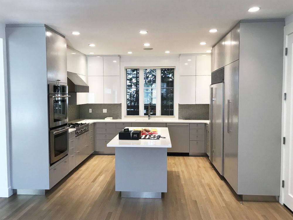
Overcast days flatten color. That’s why 2025 neutrals lean warmer and higher-LRV (light reflectance value) to keep spaces bright without feeling sterile.
- Walls: warm greige, mushroom, linen white, pale oatmeal.
- Ceilings: soft, luminous off-white to bounce scarce daylight deeper into the floor plate.
- Trim & doors: taupe or stone for subtle contrast that still hides scuffs.
Pro tip: In north-facing spaces, nudge neutrals one step warmer than you think you need; cool light will pull them gray.
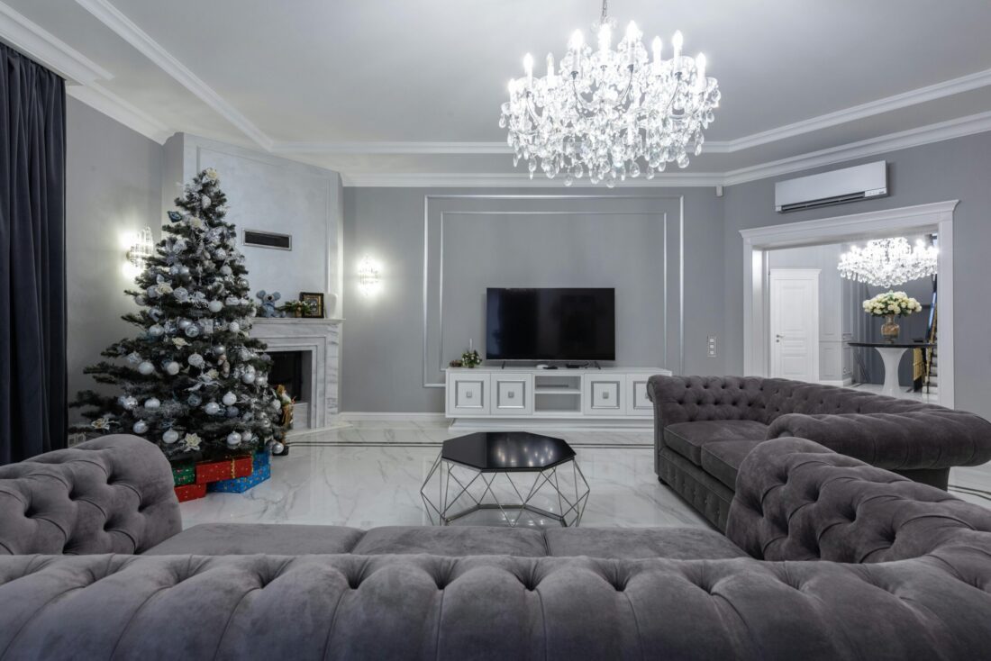
2) Biophilic Greens & Wood Tones (Beyond “Trendy”)
Seattleites crave a connection to nature. Expect sage, laurel, and moss paired with light white-oak and walnut finishes.
- Where to use: lobby feature walls, break areas, wellness rooms, lounge pods.
- Why it works: lowers perceived stress, complements exterior landscaping, and reads authentic in the PNW.
3) Brand Pops, Not Brand Overload
In 2025, brand color lives in controlled accents rather than full walls.
- Use it: reception desk panels, niche backs, elevator door skins, meeting-room portals, wayfinding stripes.
- Benefits: maintains a calm backdrop, simplifies leasing, and speeds turnover for multi-tenant buildings.
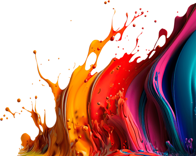
4) Confident Accent Colors (Applied with Restraint)
Muted doesn’t mean boring. Strategic accents add energy and orientation.
- Office: ink blue, charcoal plum, deep forest.
- Retail: coral red, sunflower, electric teal (small doses that guide the eye).
- Hospitality: terracotta, desert rose, mineral blue for warmth and evening light.
Wayfinding win: carry accent tones onto stair nosings, column bands, or corridor end walls for intuitive navigation.
5) Human-Centric Sheens & Durability
Finish selection is doing the heavy lifting in 2025.
- Matte/flat (premium scrubbable): open offices, conference rooms—camera-friendly with fewer glare hotspots.
- Eggshell/satin: corridors, classrooms, exam rooms—cleanable without looking glossy.
- Semi-gloss: doors, frames, handrails—high touch, high durability.
- Specialty: 2K waterborne enamels for metal frames; scuff-resistant wall systems for hospitality and multifamily corridors.
6) Inclusive Contrast & Compliance (That Still Looks Great)
Design for everyone.
- Contrast ratios: ensure readable signage and door/trim contrast against walls (aim for noticeable value shifts).
- Safety: high-visibility color on stair edges, bollards, and ramps that integrates with your palette.
- Lighting: pair higher-LRV walls with well-placed fixtures to meet glare and brightness balance targets.
7) Exposed Ceilings & Technical Areas
Modern offices still love the open-plenum look—but cleaner.
- Colors: deep charcoal or warm black to visually lift ceilings and hide services.
- Benefits: enhances daylight drama at the perimeter, sharpens brand accents, and photographs beautifully.
8) Sector-Specific Quick Plays
- Office: warm neutrals + quiet greens; branded portal pops at meeting rooms; matte on video walls.
- Retail: high-contrast perimeter walls to frame merchandise; light ceilings for brightness; bold color “moments” near POS.
- Healthcare: soft, hygienic palettes (linen, sage, pale blue); scrubbable, low-VOC systems; color-zoned corridors for wayfinding.
- Hospitality: layered neutrals + jewel accents; scuff-resistant corridors; moody, camera-ready lobbies.
- Industrial/warehouse: light-reflective wall tones to boost lux levels, safety color coding, epoxy floor striping.
9) Sustainability & Health: The New Baseline
Seattle tenants and guests expect responsible specs.
- Low/zero-VOC, low-odor systems for occupied repaints and night work.
- Mold/mildew-resistant coatings for wet zones.
- Documentation: keep a color & product log for easy touch-ups across multi-site portfolios.
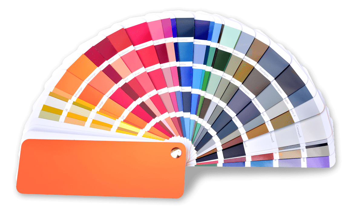
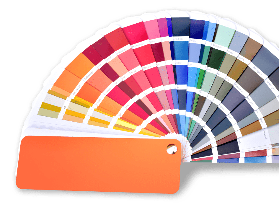
10) 2025 Seattle Palettes (Plug-and-Play)
- Calm Productivity: linen white (walls) / warm taupe (trim) / laurel green (accent) / charcoal (doors).
- Retail Energy: soft greige (walls) / bright white (ceiling) / brand red or teal (focal) / stone (trim).
- Hospitality Warmth: mushroom (walls) / walnut (wood) / mineral blue or terracotta (lounge) / bronze (metal).
Make 2025 Your Most On-Brand, Durable Year Yet
Color that respects Seattle’s light, meets accessibility, and stands up to traffic will outperform trends every time. If you’re planning Q1/Q2 repaints, align palettes, finishes, and schedules now—then phase with minimal downtime.
Hate to Paint? helps Seattle businesses spec PNW-smart colors and coatings, coordinate after-hours crews, and deliver camera-ready finishes that last. Want a quick walk-through and palette board tailored to your brand and building type? Contact Hate to Paint? for a fast, no-pressure consult.